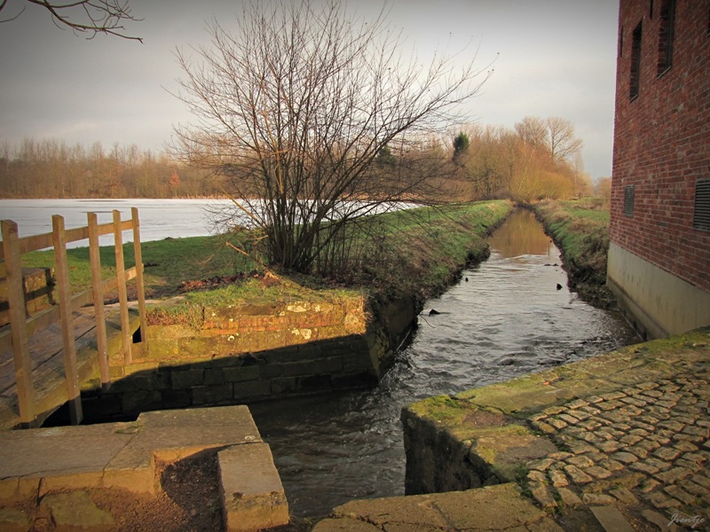
I thought the castle would also be a perfect Sepia Scenes subject. Enjoy …
But no matter how pretty in sepia, I just HAD to add the full color of that one.
The light was just too pretty! 
More Sepia Scenes here.
Don’t forget to drop by Heavenin365, the new photo blog.


10 comments:
Not only was the light too pretty to miss, Jientje, but the moss on the ledge was nice to see...the other photos look like vintage post cards!
It's beautiful, I think you could keep taking pictures and they would still be a thrill to look at. The view is so different anyway you look!!!I can only imagine how it must look in person, breathtaking! what do they do at this castle? Is it a museum?
Fabulous!
Hugs,
Margaret B
You've made the castle look like a Hollywood set. It's just perfect in sepia. (But I do like the shadows in that last one.)
That castle is gorgeous and I like the look of it in sepia.
How interesting to see the exact photo in sepia and in color (the last one). What a difference it makes! The brick walkway really stands out in the sepia one, yet the lighting IS so pretty in the color one. Two very different photos.
That first picture of the sluice gate is just perfect. I love it.
Jientje, your pictures are -without a doubt- among the most beautiful I've been looking at lately...
I would put your blog among my favourites along with other: Jackie's Casi en serio and Mishelle from Secret Agent Mama. Do you know them?
Anyway, thanks four your visit and wishes, and have a great week!
Gorgeous! It brings out how old it really is...
loved these too!
Schools in SA started yesterday, so... - only have kids-time and no blogging-time! Your photos this past week - STUNNING, AMAZING, B-E-A-U-T-I-F-U-L, ♥IT!!!!!
I love sepia scenes. I know colour is nice too but there is something about sepia is timeless.
Hello Jientje!! hope you had an awesome weekend!!
Love your 3rd post of the castle and the pictures are great in sepia!
Gena @ Thinking Aloud
a photoblog
South Africa
Post a Comment